Redesigning Honda Middle East's Website
This project reimagines Honda's Middle Eastern digital presence with a focus on product visibility and regional offerings. The redesign balances global brand consistency with localized content, implementing industry best practices to enhance the user experience.
By maintaining visual harmony with Honda's international web ecosystem while showcasing region-specific vehicles and services, the updated site creates a seamless customer journey that honors both global brand standards and Middle Eastern market needs.
ROLE
Lead UX Designer
TIMELINE
3 months
RESEARCH
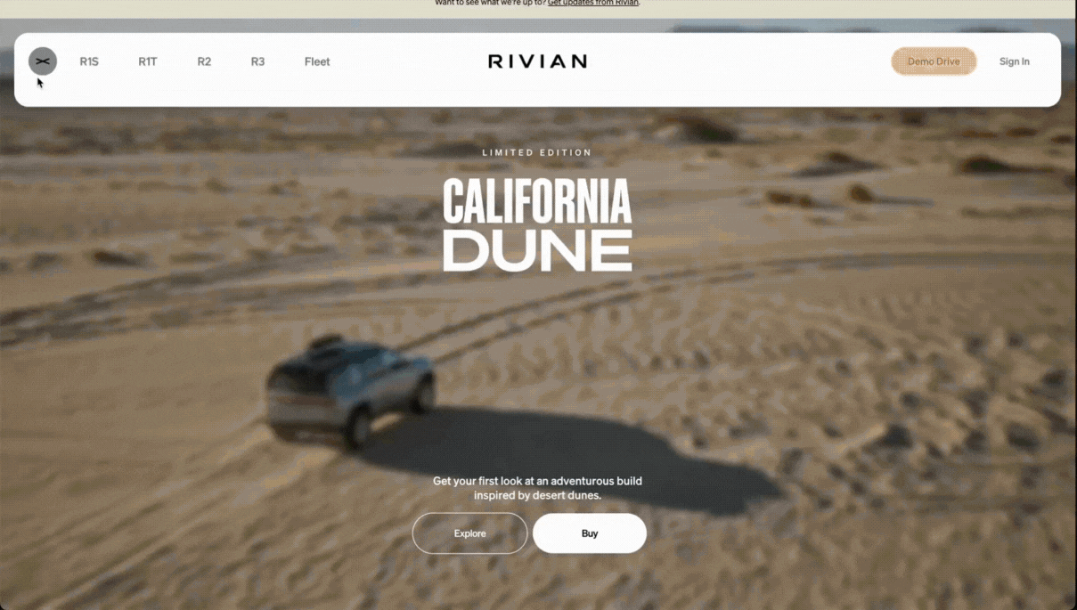
Benchmarking: Rivian
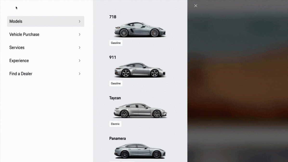
Benchmarking: Porsche Middle East
DESIGN
FINAL DESIGNS


Understanding the UAE automotive digital landscape
In the research phase, I dove into the digital world of UAE car distributors to see what we were up against. Looking at competitors' websites gave me a clear picture of the best practices and opportunities to differentiate Honda's online presence. I studied how users moved through these sites, what content caught their attention, and how to address local market expectations.
This groundwork was crucial - it helped me shape both the structure and visual elements of the redesign. I needed to create something that would speak directly to local customers while staying true to Honda's global look and feel.
One of the limitations I had to keep in mind through the research was balancing what I found with the client's specific requirements with Honda's worldwide design standards. Working within these boundaries pushed me to find creative solutions that respected the brand while delivering something fresh for the Middle Eastern market.
When looking at different competitor websites, globally and locally, my mind navigated through how the business goals and users' intention would connect.
How might a user want to be shown test drives?
How might a user want to be told about different product options?
Would a user want to know about their social pages?
How might a user feel more connected to the brand?
Having these questions and more helped me shape the narrative of the website on what's important for the users main action items when entering the site. When addressing these questions, I also got into the mind of the user wanting to buy or test drive a car. This helped shape the flow of the website and the information that I as a user would want to see. If I'm coming to Honda Middle East's page, wouldn't I already have the minimum thought of 'I want to buy a car'? I may not know the model, or the different types, or even the other car/product offerings, but knowing I want to buy a car. This helped me proceed with more UX-focused questions whilst keeping the user's experience at the forefront of my mind:
What would they want to see first?
How would they want to explore product offerings?
What type of information do they need to know to keep them engaged through the site?
How should the omni-channel experience flow through different digital touchpoints?
This thought process on the left helped shaped the way I sketched the first version of the website, taking into consideration:
-
First fold content
-
CTA placements
-
Content for Headers & Footers
-
Information architecture
-
Site mapping
-
Micro interaction
-
Writing vs visual space
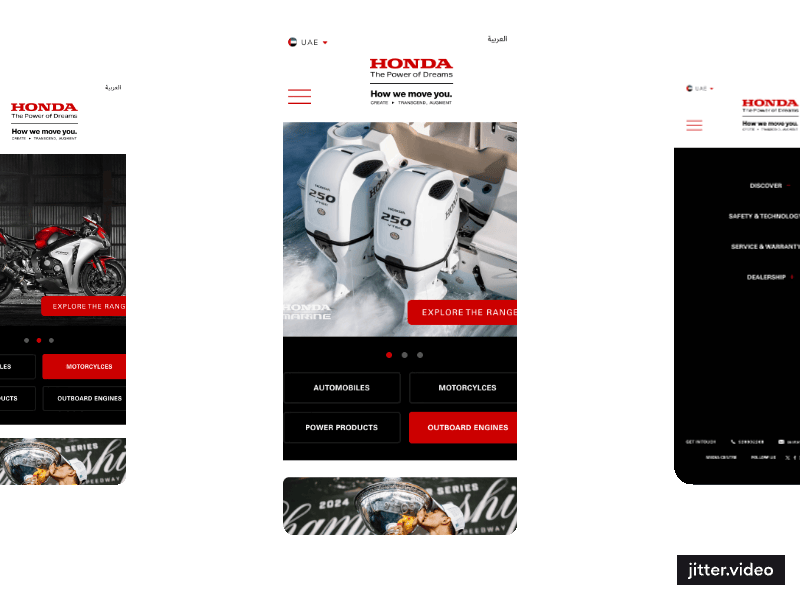
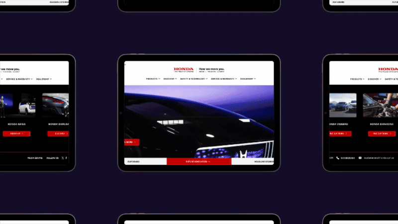
Designing an informative and explorative homepage for Honda Middle East
Through my deep dive into competitor websites, I uncovered several crucial design patterns worth implementing. I found that successful automotive sites in the region kept their homepages concise, tucking information behind intuitive tabs to prevent overwhelming users with endless scrolling.I noted how important it was to maintain visibility of social media handles, creating that seamless omnichannel experience users expect. The positioning of CTAs caught my attention too - the most effective sites placed their primary action button prominently in the first fold and strategically repeated it at key decision points throughout the journey.
Brand colors worked best as subtle accents rather than dominant elements, while navigation needed to be crystal clear for users of all ages. I also identified several relationship-building features that performed well: news sections that kept users "in the know," newsletter sign-ups for continued engagement, and carefully selected imagery that resonated with the regional audience.
These insights became my blueprint for creating a Honda site that would feel both on-brand globally and perfectly tailored to Middle Eastern users.
Putting myself in the shoes of the user, looking at the experience and brand injection
After creating the wireframe that answered the questions that came up in the research section, I started injecting the current branding into the website. This was not an easy task. As a designer, my flair is minimal and impactful, but as a user, I do want to see big, bold branding that stays with me even when I leave the website.
This juxtaposition in design ideas battled in my mind, but at the end of the day, the website had to remain close to all other global Honda websites, while striking a balance between being cultural to the region and immersive in the Honda brand.
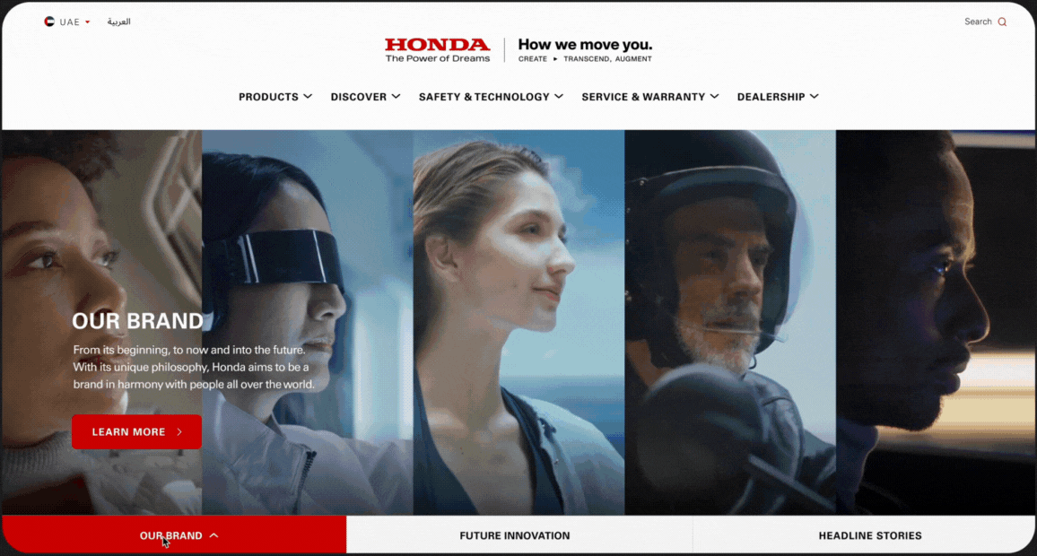
In the final designs, you can see how the experience mimics cultural benchmarking practices, adopting current user behaviours, whilst also being playful with the striking red Honda uses and injecting the branding in different and unique ways.
MOBILE VIEW
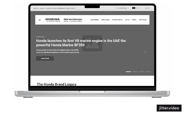
DESKTOP VIEW
Thank you for exploring this project - if you enjoyed following my thought process behind this website revamp, I'd love to connect on LinkedIn.